

“`html
Photography’s Palette: Mastering Every Shade of the Lens
Introduction
Ever look at a photo and feel… nothing? Or worse, something totally different from what the photographer intended? It’s like a song played out of tune – the notes are there, but the melody’s lost. This isn’t just about having a fancy camera; it’s about understanding photography’s true language: color.
Think of it this way: color is the emotional backbone of an image. It dictates mood, draws the eye, and even tells a story. Mastering color in photography is like learning to speak fluently in a visual language. It unlocks a whole new level of creative expression, transforming snapshots into captivating narratives. But let’s be honest, it’s not always easy.
The Color Conundrum: Why It Matters Now (and Later)
The immediate impact of neglecting color theory is obvious: your photos might lack impact. They can feel flat, uninspired, or simply wrong. Imagine capturing a breathtaking sunset over the ocean, only to have the final image look washed out and lifeless. Frustrating, right? You pour time and effort into composition, lighting, and subject matter, yet the crucial element of color falls short, leaving you with an underwhelming result.
But the long-term consequences run deeper. Ignoring color theory hinders your growth as a photographer. You’re essentially shooting in the dark, relying on luck instead of conscious decision-making. This can lead to creative stagnation, a lack of confidence, and ultimately, a feeling of disconnect from your own work. In a world saturated with images, you risk your photography blending into the noise, failing to stand out and resonate with your audience.
Consider the power of color in marketing and branding. Companies spend millions to ensure their visual identity evokes the right emotions. Imagine the impact of a perfectly color-graded campaign compared to one that misses the mark. Similarly, as a photographer, understanding how color influences perception is paramount for creating compelling imagery that communicates your vision effectively and resonates with viewers.
Unlocking the Palette: Practical Solutions You Can Use Today
So, how do you escape the monochrome doldrums and embrace the vibrant world of color photography? Here are a few practical solutions to get you started, without requiring a PhD in color science:
- The Color Wheel: Your Visual Compass
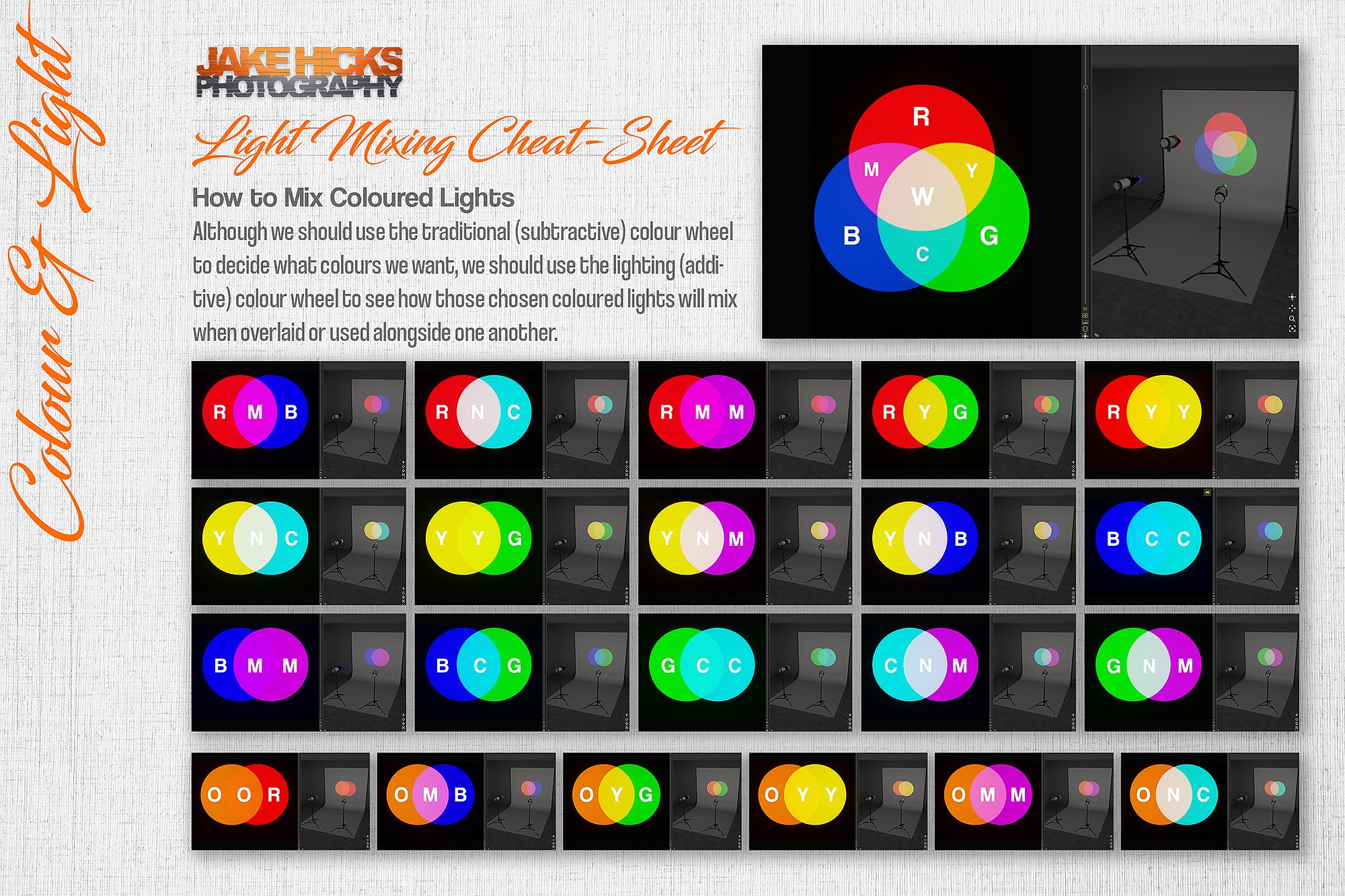
This isn’t just for art class. The color wheel is your cheat sheet for understanding color relationships. Learn the basics:
- Complementary Colors: These sit opposite each other (e.g., red and green, blue and orange). They create high contrast and visual excitement.
- Analogous Colors: These are neighbors on the wheel (e.g., blue, blue-green, green). They offer a harmonious and peaceful feel.
- Triadic Colors: Three colors evenly spaced on the wheel (e.g., red, yellow, blue). They create a balanced and vibrant composition.
Example: Think of a portrait with a subject wearing a bright red dress against a lush green forest backdrop. The complementary colors instantly draw the eye and create a visually striking image.
- Mastering White Balance: Setting the Stage
White balance ensures your colors are accurate, no matter the light source. Incorrect white balance can make images appear too warm (yellowish) or too cool (bluish). Most cameras have automatic white balance (AWB), but learning to adjust it manually is crucial.
- Experiment: Play with different white balance settings (e.g., daylight, cloudy, tungsten) to see how they affect the colors in your scene.
- Kelvin Scale: Understand the Kelvin scale, which measures color temperature. Lower numbers (around 2000K) are warmer, while higher numbers (around 9000K) are cooler.
Example: Shooting indoors under incandescent lights often results in a warm, yellow cast. Adjusting the white balance to “tungsten” or using the Kelvin scale to lower the color temperature can neutralize the yellow and restore accurate colors.
- Editing Software: Your Digital Darkroom
Software like Adobe Lightroom and Capture One offer powerful tools for manipulating color. Learn to use:
- Hue, Saturation, and Luminance (HSL) Sliders: These allow you to adjust individual colors without affecting the others.
- Color Grading Tools: These enable you to subtly shift the colors in your image, creating a specific mood or atmosphere.
- Color Calibration: Calibrating your monitor ensures that the colors you see on screen are accurate.
Case Study: Consider the work of travel photographer Chris Burkard. He uses color grading extensively to enhance the mood and atmosphere of his images, often creating a dreamy, otherworldly feel. He might boost the blues in the sky, warm up the tones in the sand, or desaturate certain colors to create a more muted aesthetic.
Alternative Approaches: Finding Your Color Style
There’s no one-size-fits-all approach to color in photography. Experiment and find what works best for you:
- Minimalist Color Palettes: Restrict yourself to a limited number of colors to create a clean and impactful image. This can be particularly effective for minimalist landscapes or product photography.
- Monochromatic Photography: Embrace a single color, using variations in tone and texture to create depth and interest. This can evoke a sense of nostalgia, simplicity, or drama.
- Bold and Vibrant Colors: Don’t be afraid to embrace bold, saturated colors for a more energetic and eye-catching image. This can be particularly effective for street photography or portraits.
Beyond the Technical: Embracing Intuition
While technical knowledge is important, don’t forget the power of intuition. Pay attention to how colors make you feel. What emotions do they evoke? Use that understanding to guide your creative decisions.
- Color Psychology: Research the psychological associations of different colors. For example, blue is often associated with calmness and peace, while red is associated with passion and energy.
- Study Other Photographers: Analyze the work of photographers whose use of color you admire. What choices do they make? How do they use color to tell a story?
The Takeaway: Color Your World
Mastering color in photography is a journey, not a destination. It’s about constant learning, experimentation, and refinement. Don’t be afraid to make mistakes. The important thing is to start exploring and embracing the power of color.
Imagine being able to walk into any scene, instantly recognize the color possibilities, and confidently capture images that evoke the exact emotions you intend. Picture your photographs not just being seen, but truly felt by your audience. This is the power of mastering photography’s palette.
So, pick up your camera, experiment with different color combinations, and start painting your world with light and color. The possibilities are endless, and the journey is incredibly rewarding. The world is waiting to be seen through your unique, color-conscious lens. Go out there and create something beautiful!
“`
